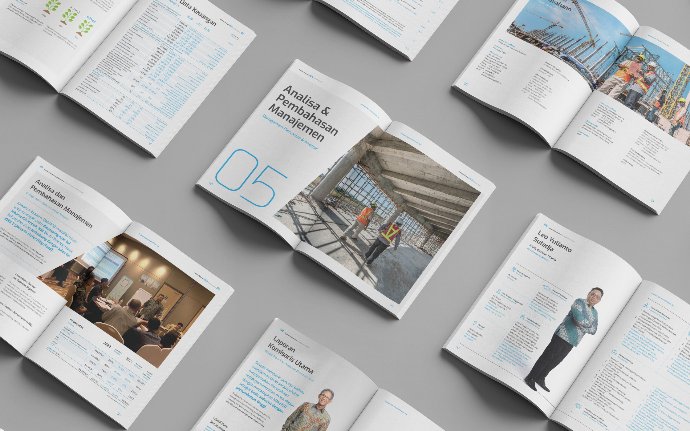
Color takes center stage in the design, playfully reflecting the company’s values of supporting people and the environment.
This project is part of my 8-year designing a series of annual reports. While the first two years were relatively straightforward, the real challenge began in the third year and beyond. Each year, the client provided the same brief, the same report title, and the same design direction. The task was to create a design that stayed true to the core elements while feeling entirely new and visually distinct each time. It’s like photographing the same scene from different angles and lighting setups.
For this year, the design is dominated by blue and green tones, reflecting the company’s commitment to sustainability in both the annual and sustainability reports. The clean grid is paired with isometric illustrations, bold typography, and subtle gradients.
This project is part of my collaborations with a creative agency.
Layout Design
Art Direction
Illustration