
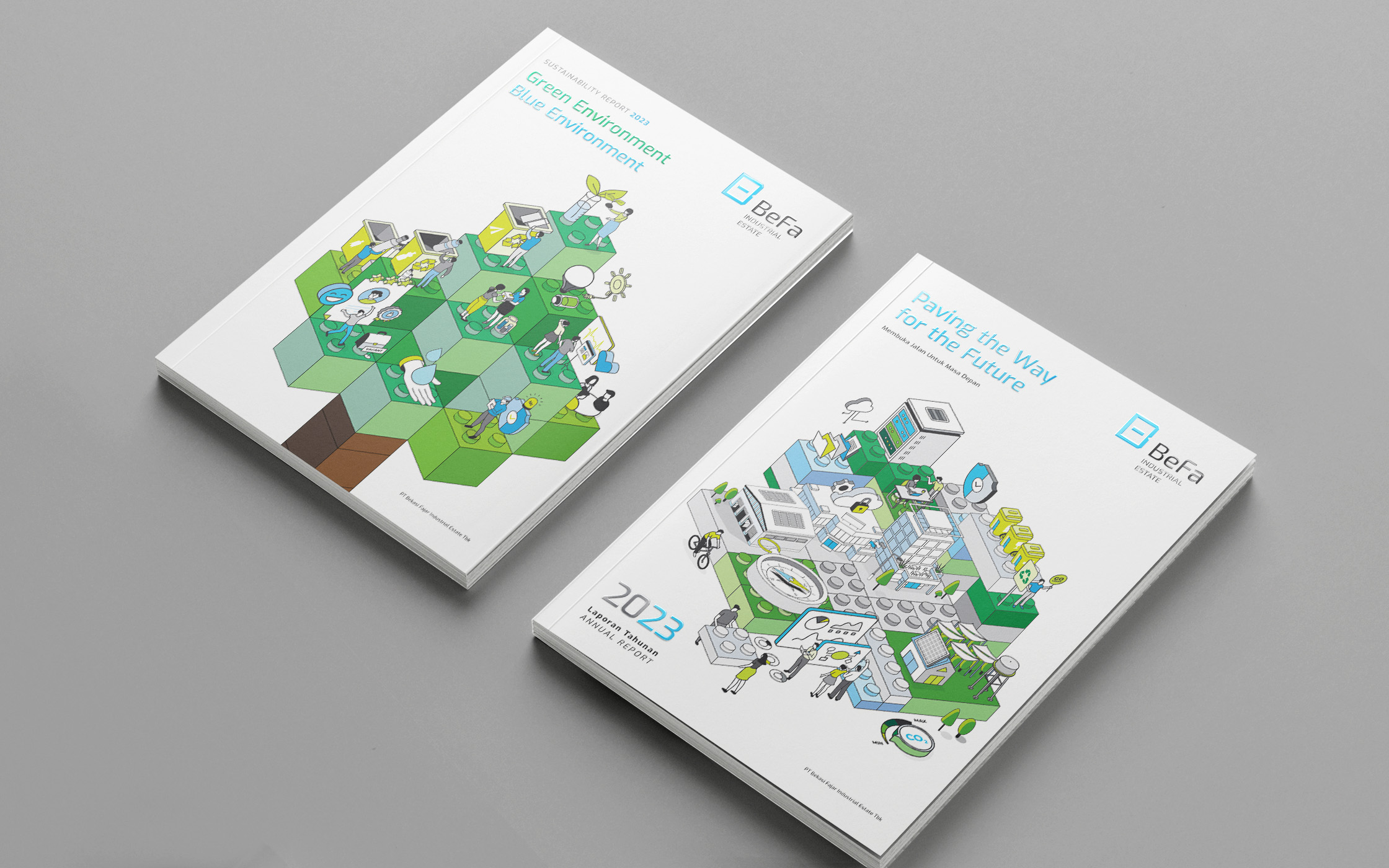
A fresh, minimal design that reflects the company’s achievements over the year, with a clean, modern look that invites exploration.
For this year, the design brief called for something new, rather than repeating previous designs. I was thrilled when I suggested a minimalist style, and the client loved it. The design features LEGO-inspired line illustrations with scenes that metaphorically represent the company’s values. The result is a fresh, modern take on the company’s identity. A bold move toward simplicity and clarity.
The grid and layout were crafted to be minimal and clean, with a white-grey color scheme and subtle touches of blue and green. These elements are paired with light typography and infographics to emphasize key statistics in each section.
This project is part of my 8-year-long run series of reports and one of my collaborations with a creative agency.
Layout Design
Art Direction
Illustration


