
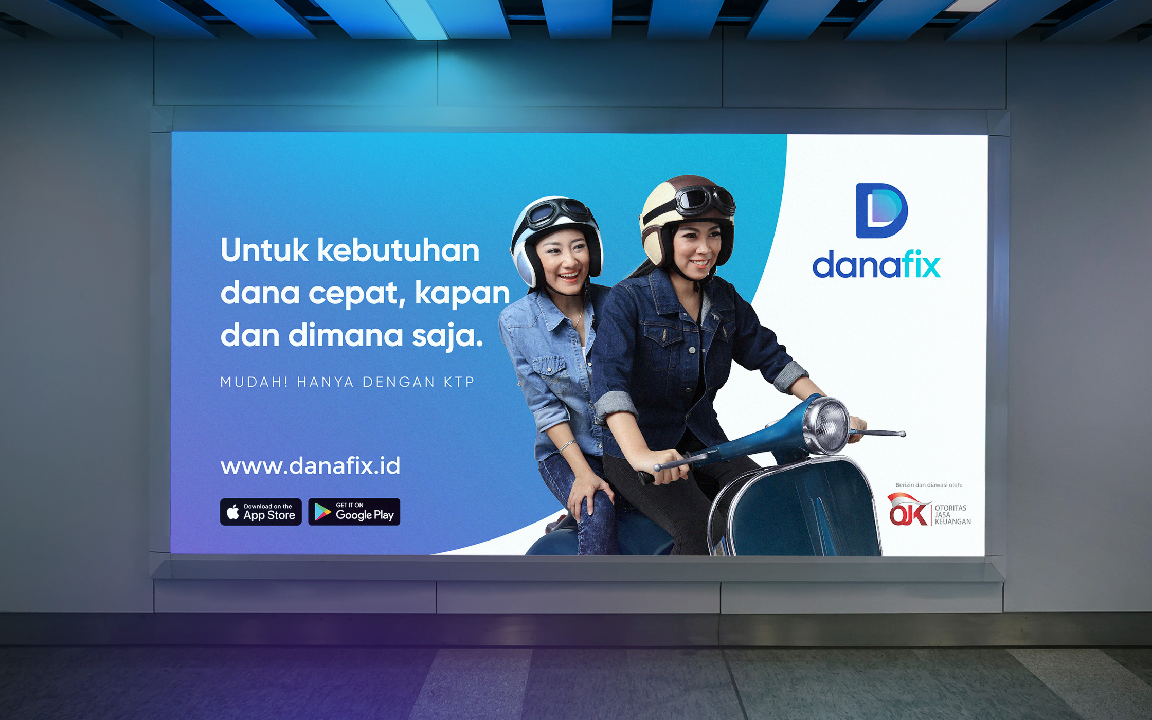
A branding that embodies the essence of a dynamic global financial technology providing easy and efficient online cash loans, a hassle-free financial solution as a trusted financial partner.
DanaFix brand aims to appeal the Millennial Generation as a smart solution for financial challenges. The client’s goal was to make the brand appear fresh and trustworthy while standing out in terms of the color palette. I decided to emphasize color as a crucial part of the brand language to maximize its impact on digital platforms. I chose a blending of colors between blue and purple and creates a dynamic digital gradient.
The logogram features a metaphor of completing a puzzle, visualized as the shape of the letter ‘D’ with a puzzle piece ready to fill the gap. This symbolizes a trusted solution for financial matters, with the gradient on ‘the last piece of the puzzle’ reflecting the company’s fresh optimism as a financial partner.
As for the brand identity, DanaFix adopts a direct and bold tone of voice. The simple ‘D Gradient’ graphics, combined with bold layouts, strong typography, and natural-looking images of people, create a powerful mix of useful information design. Non-essential elements are stripped away to maintain clarity and accessibility while conveying a bold attitude through typography and color.
Branding
Visual Identity
Print + Stationery
Art Direction
Website Design
Mobile App Design
Social Media


